Project 9

    • Message: I am an accomplished designer with visual communications.
    • Time Spent Making Corrections: I spent about two hours making corrections to past projects.
    • Audience: Anyone who is looking for my skills as a visual communications designer.
    • Top Thing Learned: I learned how to create designs with visual communications.
    • Future application of Visual Media: I think I will be able to apply the design principles to areas of my professional life. I’ve noticed myself using the design principles when I am creating documents in other parts of my life and I think it is going to help me a lot in my professional life.
      • Thumbnails of Images Used: 

wildtextures_white-brick-wall


Project 8

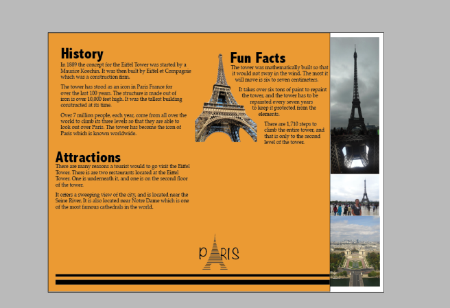
P8-CassieSharp-FrontandBack P8-CassieSharp-InsideDescription: A brochure that informs people about the Eiffel Tower in Paris.

Process (Programs, Tools, Skills): To design this brochure I used Adobe InDesign to design my layout. I then used Photoshop to edit pictures and cut them. I also used Adobe Illustrator to design my new logo. It was really neat to use all of the skills that I have learned in all these programs to create something. I realized how much I have learned this semester.

Message: Information relating to the Eiffel Tower.

Audience: Anyone interested in the Eiffel Tower

Top Thing Learned: How well these programs work hand in hand if you know how to use them.

Color scheme and color names: Complementary: Blue and Gold

Word Count of copy: 251

Sources (Links to images on original websites): http://7-themes.com/6978563-eiffel-tower-hd-wallpaper.html

P7 – Web Page

P7CassieSharpScreenshot

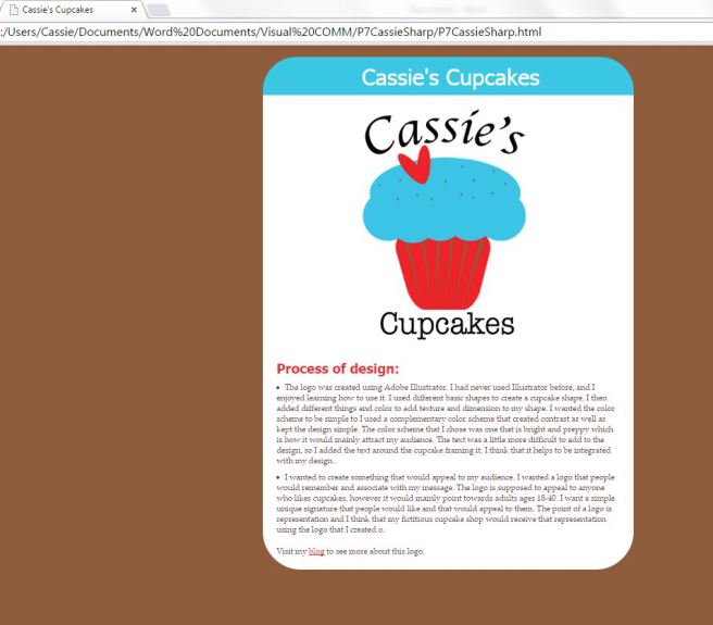
Description: This is a web page for a cupcake company that I created.

Process (Programs, Tools, and Skills): I started this by creating a logo in Adobe Illustrator. I then used HTML and CSS to create a webpage. HTML and CSS were difficult to learn at first, but once I started to understand how everything worked it made it a lot easier. I continued the color scheme from my logo and integrated that into the web page. I used HTML to build the basic structure of the webpage, and then I used CSS to design it to match my logo.

Message: This cupcake shop is modern and fun.

Audience: Adults ages 18-40

Top Thing Learned: The top thing that I learned was how to use HTML and CSS to create a webpage.

Color scheme and color hex(s): Complementary #EE2D32 #39C7E3 #8E5C3B

Title Font Families & Category: Tahoma – sans-serif

Copy Font Families & Category: Palatino Linotype – serif

Changes made to the CSS: I changed the color scheme, header border, image alignment, fonts, and hyperlink color.

Word Count: 178

P5 – Illustrator Logos

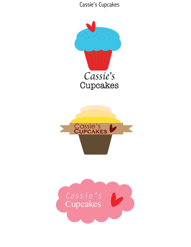
CassiesSharp-P5Logos Description: These are three different logo for an imaginary cupcake shop.

Process (Programs, Tools, and Skills): This was a super fun project because I got to learn how to use Adobe Illustrator. Using Illustrator I used basic shape tools to create my different logos. It was really fun to see how you can use something simple like a circle or an ellipse to create something like a cupcake. I used different typography and color schemes in order to get different looks in the logos. I tried to create diversity in my logos, and I also added a heart which gave some repetition to my logos.

Message: These designs convey the message of a cute and preppy cupcake shop.

Audience: These designs are to appeal to anyone who loves cupcakes.

Top Thing Learned: The thing that I learned was that once I had an idea that I really liked there was no end to what I could do. I’ve always thought that I was not very creative, but when I have an idea that I really like, I can be very creative with that.

Three Color Scheme and Color Names: First Design: Complementary – Red and Teal; Second Design: N/A; Third Design: Monochomatic – Red.

Three sets of Title / Body Font Names & Categories: First Design: Apple Chancery and American Typewriter; Second Design: Century Gothic and Copperplate Gothic Bold; Third Design: Letter Gothic STD and Kannada MN

Votes on favorite logo:

Top Logo = _8_; Middle Logo = _2_; Bottom Logo = _0_;

My favorite logo is: The top logo.

Project 4 – Photoshop Montage

CassieSharp-P4Montage

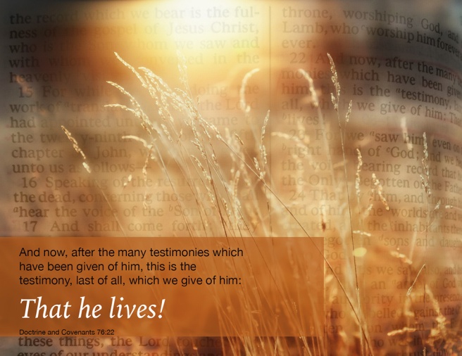
 1. Description: This is a poster that is supposed to be inspirational. It uses text and the blending of two pictures through a process called montage.

2. Process: My process started finding the picture of the wheat online. I also took a picture of the actual pages of scripture where my quote was taken from. Using Photoshop, I blended the two pictures using a masking layer. After blending the two pictures together, I added the gold box so that I could insert text into the image without the two texts being confused with each other. The last thing that I did was I created contrast in my text by using different fonts, sizes, and colors.

3. Message: My message is to inspire people through my testimony of the Savior. This scripture is one of the best ways that I could convey the message.

4. Audience: My audience is anyone who will read this, but mainly adults 18 and over.

5. Top Thing Learned: The thing that I learned the most in this project is how important it is to make sure the elements of a design work together.

6. Filter / Colorization used and where it was applied: There was no colorization in my design.

7. Color scheme and color names: Monochromatic – Gold

8. Thumbnails of Images used:

16779 IMG_0157

Sources (Links to images on original websites / with title of site):

 http://www.wallconvert.com/wallpapers/nature/morning-sunlight-16779.html

Project 3 – Photoshop

P3-CassieSharp1. Description: This was created with a triadic color scheme which echos the picture on the top. The bright colors connect with the audience and make it stand out.

2. Process: I took the picture, and edited it on Photoshop. Then, using Photoshop I designed this image. I took the brick and lime colors from my picture, and then added indigo to add contrast. After, I added the Chris Hedges quote to help communicate my message.

3. Message: My message was students, especially college students, need to realize education is to help us learn. We need to keep that in mind rather than focusing primarily on future careers

4. Audience: College aged students ages 18-28.

5. Top Thing Learned: I think the most important thing I learned was the importance of a color scheme. I didn’t realize how much a color scheme can change a design.

6. Color scheme and color names: Triadic- Brick, Lime, and Indigo.

7. Copy Font Name & Category: American Typewriter – Modern

8. Thumbnail of original, unedited image inserted:

006

9. Date and location you took photos: Tuesday February 3, 2015. David O. Mckay Library.
Project 3 Photography

CassieSharp-01-Light-Outside

Light 1: Outside

CassieSharp-02-Light-Inside

Light 2: Inside

CassieSharp-03-Foreground

Focus: Foreground

CassieSharp-04-Background

Focus: Background

CassieSharp-05-Thirds

Composition 1: Thirds

CassieSharp-06-Lead-Room

Composition 2: Lead Room

This was the first time I edited pictures I had taken myself. Learning the different ways to use a digital camera was very exciting. I leaned how to operate a digital camera, and how to make pictures look more professional.

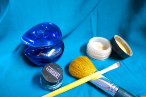
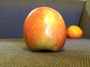
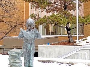
I started with my view of campus from my apartment. I used Photoshop to help me create more depth in the image. The second picture was some of my favorite beauty products arranged on a fabric covered chair. Photoshop helped bring some of the colors in the image. The third and fourth pictures I used the camera to change the focus on the apple or tangerine. The fifth picture I used the statue and tree to create a proportional area of thirds. I also used Photoshop to get rid of some shadows and sharpen the image of the statue. In the last picture, my beautiful friend posed for me to create a lead room picture. I used Photoshop to get rid of shadows and to sharpen her eyes and hair so they looked more focused.

Project 1 Flier

Cassie-Sharp-InDesign-Flier


Description:

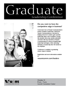
A grey-scale flier, advertising a leadership conference.

Process (Programs, Tools, Skills):

The first thing I did was sketch some different designs and layouts. After sketching, I used Adobe InDesign to create my design. I used clean lines and even borders to create clean professional look. The two different boxes echo each other to create repetition. I also made sure there was enough white space to keep the design from looking cluttered. There is contrast within the title in colors and text size, and also contrast in the body text where the lead-in question and the website are bigger than the rest of the body text.

Message:

I am trying to send a message to graduates about a leadership conference that will help them learn better leadership skills that will benefit them in the work place.

Audience:

My audience is graduates, ages 24-30, that are trying to make themselves more marketable.

Top Thing Learned:

I learned how white space is probably the most important part of a design. If there is not enough white space or if there is too much, the design will not have a professional look.

Copy Font Name & Category:

Gills Sans- Sans Serif

:Links to images used in this project:

https://130.commbyui.org/wp-content/uploads/2013/01/VouantLogo1.png

https://130.commbyui.org/wp-content/uploads/2013/01/JuliePeterson-Leadership-conference-business-rexburg-Idaho_7576-as-Smart-Object-11.jpg